 Five Tips to Improve Your Blog Photos
Today while editing my photos, I realized that I have improved VASTLY over the past nine years of blog photography. So I thought I would share my five tips to improve your blog photos, using my own photos as a base. The thing is, though, neither setup is a bad one. Both locations have pros and cons. Keep in mind that I’m not pitting these against each other(though I DO have a favorite): I am utilizing them to show things you can improve while taking blog photos.
Also, keep in mind that while I do consider myself a professional, I am entirely self-taught and my focus is on portrait and personal style photography. I think these tips can work well for anyone but may not work for every situation! But without further ado, here are my five tips to improve your blog photos.
 Blazer, thrifted (similar) | blouse, thrifted (similar) | skirt, Amazon | shoes, Modcloth (similar) | beret, Amazon
1. Create a Frame around Yourself
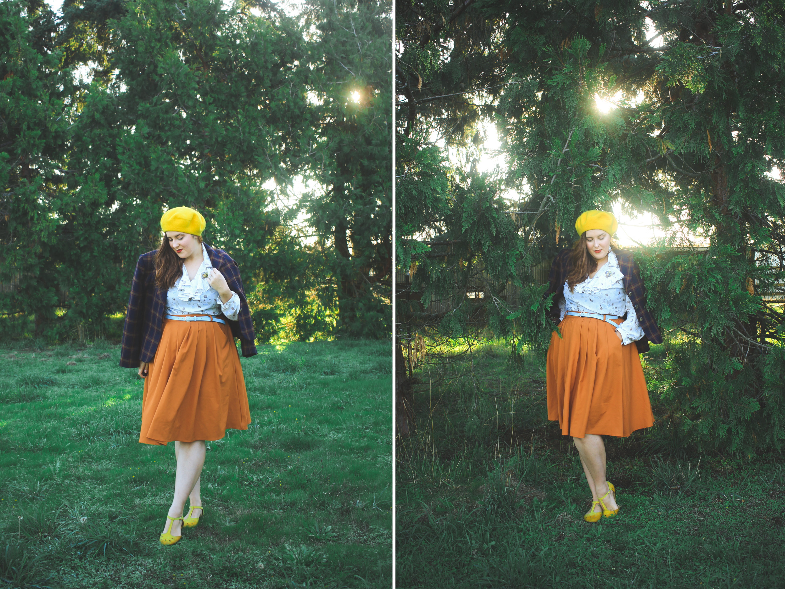
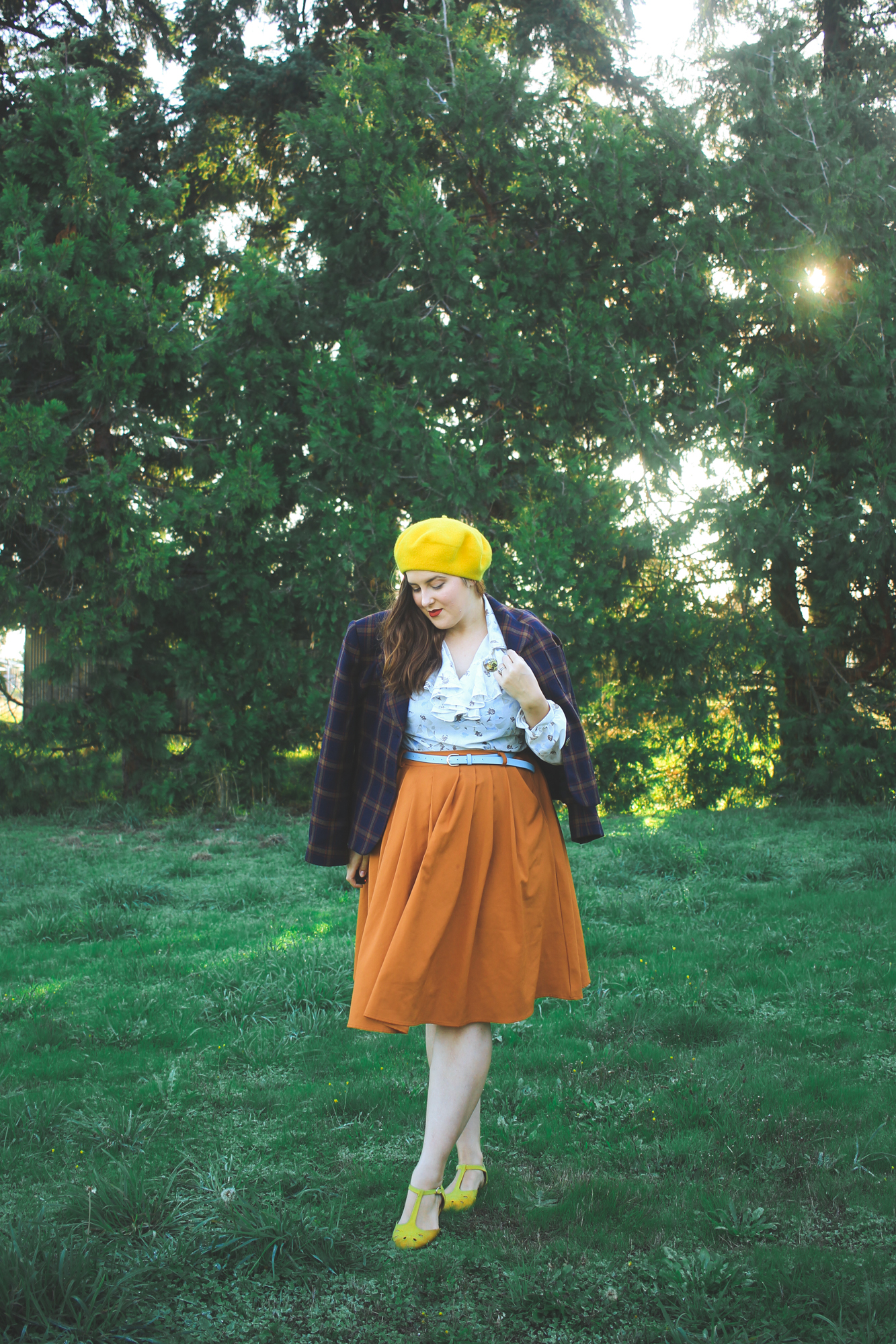
Now, I like the above photo. It’s the first location I stood in, and it’s a great way to make my outfit pop. It works really well for a more posed portrait style. But, there is no frame in the photo. None of my surroundings do anything to draw the attention to the middle of the photo where I am. If I were wearing colors that were in less contrast with the green grass and green trees, everything would just… blend.
I also don’t think this photo works very well in a blog format, especially when you’re reading or viewing from your computer where the screen is larger. Since there’s very little color texture in the background (i.e. it’s all one color) and there’s nothing framing me, on a larger screen my eye just slides right over it listlessly. To avoid this, I could have taken a few steps over to where there’s a little stand of birch trees (the ones in this post) and created a side-frame! And voila! A little help to create more interest for the eye.


2. Create Depth
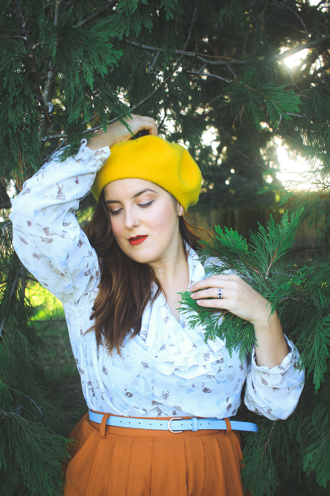
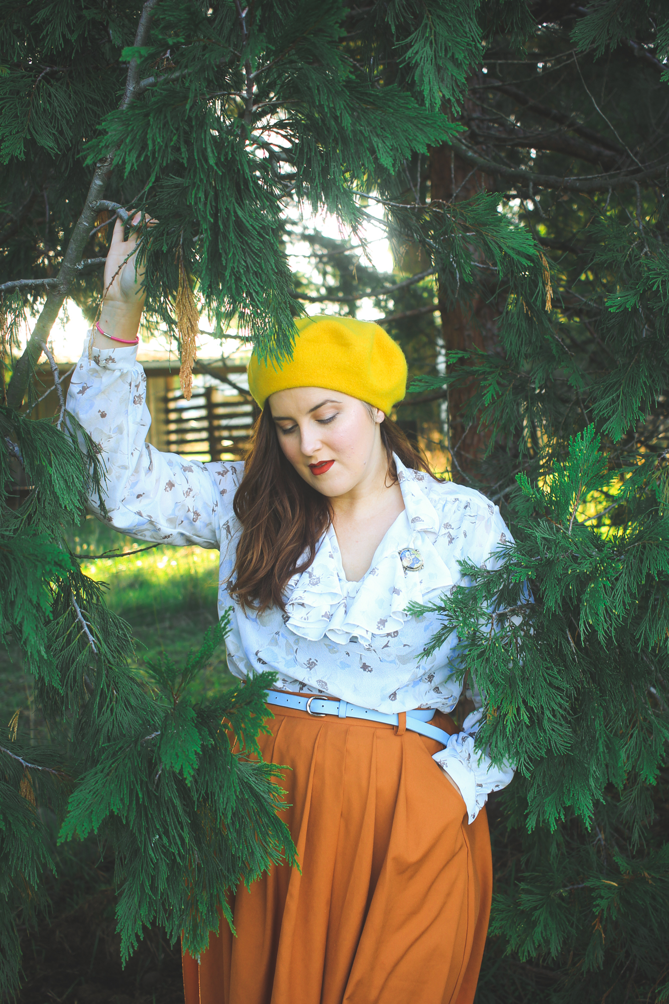
In this secondary set of photos, I had decided to step back into the trees behind me to create a little more framing and also depth. Out in the open field, my outfit popped but there was very little to break up the wall of green surrounding me. Now, there’s texture to my surroundings. Pops of yellow and brown and lighter green break up the branches. The sunlight peeks through the trees. My eyes have more guidance on where to land as the trees are framing around me.
There is even more texture and depth in the way the ground looks. Instead of being a giant field of endless green, it’s choppy and bumpy. You can see the taller and shorter strands of grass, the spots of tan and yellow and brown, and the shadows throughout. While my shoulders blend in a little more with the darkness of the trees, I’m framed in a way to draw your eye straight to me.
 3. Put the Sun Behind You
Golden Hour is a well-known beautiful time to take photos. But I have seen a trend lately where many people face the golden light of sunset, and I’m here to tell you to do the opposite. Don’t get me wrong: facing the light can be a great tool when used properly. For example, if you want to throw your surroundings into darkness and utilize light and shadow to create a dramatic effect, face the light partially. If you want to be the only thing highlighted in the photo, face the light. But so many people are missing the beauty of backlighting at golden hour!
You can see in my photos here how beautiful golden hour backlighting can be! It creates a glow around you, bathing your hair and body in gold, and the opportunity for some incredible sun-flare is amazing at golden hour. But even when it’s not golden hour, having the sun behind you just works. Neither you nor your surroundings will be too dark or too light. It still creates a glow, and you will be softly lit rather than harshly highlighted. A word of caution, though, make sure your light is always a bit filtered. As you can see in the full length photo above, I hadn’t realized just how bright the sunspots were behind me and some areas are a little too glowy.
Here is a good example of backlit photos with controlled, filtered daytime sunlight.

 4. Avoid Distracting Horizon Lines
In the above field photos, the horizon line behind me cuts right through my waist. This is not necessarily a bad place to have a horizon line, as it’s a subtle way to draw the eye to the middle of the photo. But as you can see here, if your horizon line is too high it feels a bit awkward and also works to make you look shorter.
I also avoid having a horizon line directly behind my head. And, side note, straighten your lines out! I had this drilled into me a few years ago and it’s stuck with me since. I always try to make sure any obvious lines (horizon lines, building edges, windows, etc) that aren’t off-kilter. As you can see in that previous post, I didn’t always straighten my photos. The result means it all looks and feels off which, in turn, distracts the eye and draws focus away from you.


 5. Mind Your Angles
And finally, something I used to abuse all the time: camera angle. I’m not talking about how I posed to the camera, but rather what angle I shot myself from. The general rule of thumb for great full body or half body shots are: a camera that is about waist-to-chest high for full body shots, and at eye-level for half-body shots. In the past, I used to think that positioning the camera higher for full body shots would make my face look thinner (sigh), but it also made me look shorter. Having an angle that is too high will shorten your lower body. Too low, and it’ll shorten your upper body as well as catch all the shadows under your chin and eyes in a less flattering way. At mid-level, it creates a nice line and all of your proportions will be just right.
So that’s it! Those are my five tips to improve your blog photos. Of course, I could go on and on about lighting and editing and cropping and framing… but I’ll leave those for another post. If you want me to write more posts on photography and what I’ve learned over the years, please do let me know below!
Bonus tip: get yourself a tripod and a remote shutter release! Changed the game for me.
Blazer, thrifted (similar) | blouse, thrifted (similar) | skirt, Amazon | shoes, Modcloth (similar) | beret, Amazon


